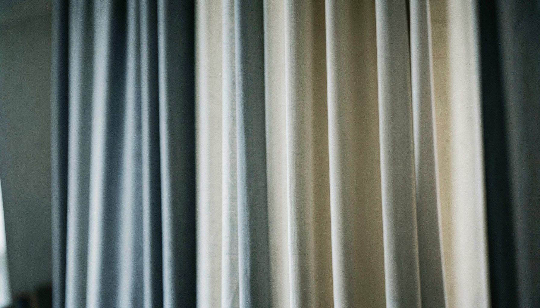
Create a monochromatic look with curtains
A monochromatic look with curtains is less about hiding colour than creating depth through closely related shades. Repeating a single hue across window treatments, walls, furniture and accessories makes a room feel composed and connected without relying on bold contrasts.
Begin with the finishes already in your home, then build a tonal palette around them. Fabric, texture and window coverage matter as much as matching colours, especially in Australian homes where bright summer days, cool winter evenings and open-plan living areas each demand a different response.
Choose a tonal palette that feels connected
Start with one base colour and look for nearby shades and tints rather than unrelated colours. Warm beige, sand and mushroom create a soft envelope, while sage, olive and eucalyptus lean cooler. For blue-grey rooms, dove, slate and deep navy accents keep the scheme calm without making it flat.
Light changes the result. A pale textile that looks serene in a showroom may glow yellow in afternoon sun, while a dark drape can absorb heat and make a small room feel enclosed. Test paint and fabric swatches beside the window at different times, then compare them with your floor, skirting boards and furniture.
Build your curtains around colour and texture
Fabric choice lets you vary a tonal scheme without introducing a contrasting colour. Linen-look woven textiles bring relaxed texture, cotton and cotton-blend give a crisper finish, and a subtle sheen adds polish. Tone-on-tone patterns can work, but their contrast should remain gentle enough to read as depth rather than a separate motif.
Consider the entire window: curtain panels, a valance or pelmet, the rod and even the lining shape the final effect. Blackout and insulated options help with privacy and temperature control, while sheer curtains soften glare without hiding the outside view. Explore factory-direct custom draperies and request fabric samples before committing; check the measurement format and delivery details for Australia.
Textile finishes should suit local conditions. Brisbane's humid summers call for washable, breathable fabrics that dry readily, while Perth's intense sunshine makes generous window coverage especially valuable. Sydney's bright coastal light reveals every variation in weave, so inspect samples beside the actual window.
Layer sheers, panels and window accents
Layering creates depth in a single-colour scheme because each fabric catches light differently. Hang a sheer or voile behind a heavier panel, or use one track for both, rather than stacking competing treatments. Keep the hardware simple: a slim rod in a matching neutral or subtle metallic finish supports the look without becoming the focal point.
Australian homes often favour generous, floor-skimming drapes in bright living rooms, but the drop should suit the room's proportions and cleaning routine. Melbourne's changeable spring weather rewards adaptable layers, providing shade on warm afternoons and extra warmth when evenings turn cool. The same combination works in a sunroom, bedroom or compact apartment.
In a monochromatic room, texture can do the work that pattern normally would. Use woven borders, gathered headings or a lightly textured weave to add dimension, then repeat one detail in cushions, throws or a rug. The result stays restrained yet avoids the flatness of perfectly matched everything.
Scale the window treatment to the room
Proportion matters more than perfect colour matching. A rod wider than the window frame can make the opening appear larger, and panels set high and wide suit the glazed doors found in many Australian homes. Where architecture allows, mounting near the ceiling draws attention upward. In lower rooms, a restrained drop preserves balance.
Before ordering, measure the rod or track width, the available drop and the space for stacked panels. Custom sizing helps avoid fabric that is too short, too narrow or excessive. Check how doors, heaters and furniture interact with the curtains, and ensure the finished length does not create a tripping hazard in a busy family area.
Colour relationships extend beyond the frame. Repeat the curtain's deepest tone in a small object, such as a vase or lamp base, while letting lighter shades appear in bedding or cushions. For visual direction, curtain styling ideas offer a useful starting point for balancing scale, texture and shade.
Check the tonal scheme before ordering
A useful tonal plan is simple enough to remember and specific enough to guide each purchase. Use these checks to connect your curtains with the rest of the room without making it feel overly coordinated.
Curtain palette
- Pick one base hue and two closely related shades.
- Coordinate the rod, lining and any valance with the same colour family.
- Compare fabric samples in morning and evening light.
- Confirm privacy, insulation and light-control needs before choosing fabric.
Room palette
- Repeat a curtain shade in cushions, bedding or a rug.
- Add interest through texture rather than contrasting prints.
- Keep large furniture and architectural finishes visually consistent.
- Use a deeper tone sparingly to anchor the room.
Walk through the room with the samples and view the scheme from the doorway. Notice whether the curtains lengthen the space or make it feel crowded, and adjust the rod width or panel drop accordingly. Virtual room design tools can help you test colour relationships before custom pieces are made.
Start with a fabric sample and a clear colour story, not a rushed full-room purchase. Factory Direct Drapes offers custom sizing, installation resources and a lifetime workmanship warranty, with sheers, blackout panels and decorative rods available for a coordinated scheme. Check shipping details to Australia before placing your order.
Choose your base hue, gather the samples and build the layers around how your home is used. Create a room where the curtains feel like part of the architecture and the repeated shades bring calm, depth and warmth to every season.