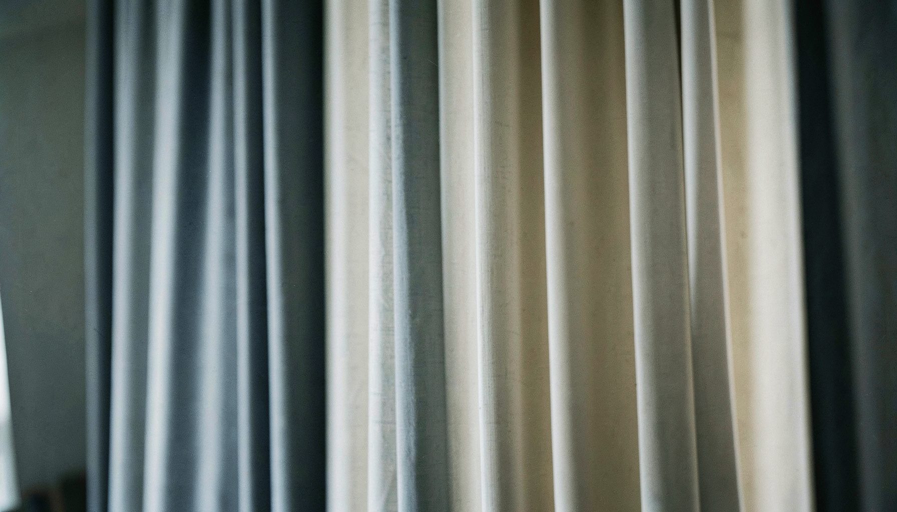
How to Coordinate Drapes with Wall Colour and Furniture
The right window treatment can connect the major elements of a room without making everything look overly matched. When drapes, wall colour and furniture share a thoughtful relationship, the space feels balanced, comfortable and intentionally styled.
Australian homes often need to manage strong daylight, heat and privacy alongside appearance. A north-facing living room in Sydney, a bright apartment in Brisbane or a cool Melbourne terrace may each require a different combination of fabric weight, lining and colour. Start with the room’s natural light, then build the palette around your existing furnishings.
Read The Room’s Light First
Natural light changes how fabric and paint appear throughout the day. Warm sunlight can make beige, cream and terracotta drapes look richer, while cool daylight may emphasise blue or grey undertones. Test fabric samples beside the wall and furniture in the morning, afternoon and evening before making a final decision.
For homes in Perth, Adelaide or regional areas with intense sun, consider lined, insulated or blackout curtains to reduce glare and protect upholstery. In a darker Melbourne room, lighter sheers can preserve daylight while adding softness. These practical choices should guide your colour selection rather than being treated as an afterthought.
Match Undertones Rather Than Exact Shades
Drapes do not need to be the same colour as your walls. In fact, an exact match can flatten the room. Instead, compare undertones: a warm white wall usually works with ivory, sand, camel or muted olive, while a blue-grey wall may suit charcoal, smoke, navy or dusty lavender.
If the walls are strongly coloured, neutral window coverings can calm the overall scheme. Conversely, plain white or pale grey walls provide an opportunity for patterned curtains or a deeper accent colour. Repeat a subtle tone from a rug, artwork or cushion so the drapery feels connected to the room.
Use Furniture As The Visual Anchor
Large furniture pieces often have more influence than small decorative accessories. A caramel leather sofa pairs naturally with oatmeal, rust, tobacco or soft green curtains. A charcoal modular lounge can support crisp white sheers, stone linen-look panels or deep navy blackout drapes.
For timber furniture, identify whether the wood is honey-toned, reddish, pale or near-black. Choose curtain colours that complement its warmth without copying it precisely. In an open-plan Australian living area, matching the drapes to a secondary furniture tone can help define the seating zone while keeping the broader space cohesive.
Balance Pattern, Texture And Scale
When furniture is patterned, choose relatively quiet drapes with a tactile finish. Linen blends, woven textures and subtle slubs add depth without competing with upholstery. If the furniture is simple, a stripe, botanical motif or geometric print can bring personality to the windows.
Scale matters as much as colour. A small print may disappear across wide sliding doors, while an oversized pattern can dominate a compact bedroom. Sample the fabric at full width if possible, particularly for large windows in Sydney apartments or expansive family rooms common in newer suburban homes.
Choose Sheers For Layered Softness
Sheer curtains are useful when you want filtered daylight and daytime privacy without closing off the view. White and ivory sheers create an airy feel, while flax, mushroom and pale grey versions give the room a warmer, more tailored appearance. For inspiration, explore these sheer curtain ideas when working with pale walls or coastal interiors.
Layer sheers with heavier side panels when the room needs evening privacy, insulation or stronger light control. This combination works particularly well for bedrooms and living rooms facing busy streets, where a single lightweight curtain may not provide enough coverage.
Coordinate Hardware And Hemlines
Decorative curtain rods, rings and finials should support the room’s existing finishes. Black hardware can echo window frames, lighting or metal furniture, while brushed nickel suits contemporary interiors. Warm brass and bronze complement timber, tan leather and traditional architectural details.
Hang the rod wider than the window where possible, and position it high enough to create a longer visual line. Drapes that just touch or gently break at the floor usually look more polished than panels that stop several centimetres above it. Measure in centimetres and account for tracks, rod projection and floor irregularities before ordering.
Select Fabric For Everyday Living
Style must work with the way the room is used. Homes with children, pets or frequent entertaining may benefit from durable, washable or tightly woven fabrics. Bedrooms often call for blackout lining, while media rooms need excellent glare control. In hot Queensland conditions, thermal lining can make a noticeable difference to comfort.
Custom sizing allows the finished curtain to suit unusual windows, corner arrangements and wide glass doors. Factory Direct Drapes offers custom drapery options with fabric samples, measuring guidance and handmade construction, making it easier to coordinate appearance with practical performance.
Order samples before committing, compare them against painted walls and place them beside the largest furniture piece. Once the colours, textures and lining are working together, select your preferred custom style and use the available measuring and installation resources to achieve a clean finish.